
Hey hey! I’m in the February issue of Elle, in the ‘New Scene / 20 Young Talents’ article.
Check it out! Kylie says it’s cool.


Hey hey! I’m in the February issue of Elle, in the ‘New Scene / 20 Young Talents’ article.
Check it out! Kylie says it’s cool.


TipoBerba 2012 // Cyrillic Type Design Workshop
TipoBerba 2012 was the 2nd Cyrillic Type Design Workshop, organized by Tipometar, and funded by the Ministry of Culture of Serbia. The workshop lasted ten days and was held in the village Tršić – the birthplace of Serbian linguist/language reformer, Vuk Stefanović Karadžić. For more information (and a look at all the posters) check out the TipoBerba Behance page. More in Serbian here and here.


 Vedran Eraković, Jana Oršolić and Borut Vild gave lectures about various aspects of design – and presents! The booklet below is a type specimen for Balkan, a new typeface system by Nikola Djurek and Marija Juza, which consists of Latin and Cyrillic scripts.


 TipoBerba 2011 Exhibition – Posters from last year’s workshop were displayed during Vuk’s Fair.


 Stop! Hammer time! When we weren’t working, we spent most of our time fearing for our lives (the woods of Tršić are home to one of the Serbia’s most notorious serial killers – Tkač).


 Pretty cool! TypeClinic was featured on Design:Related and Behance.


TypeClinic // International Type Design Workshop
The 5th International Type Design Workshop, TypeClinic (previously TipoRenesansa) was held in the Trenta Valley, Slovenia, from the 19th-26th of August. During the workshop, I continued to work on my graduation font Nioki, using Multiple Master in FontLab. If you are interested in participating in the 6th (winter) workshop, send an email to tomato@tomatokosir.com. Squirrel nipples!


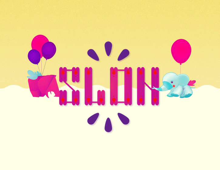 Slon – Childrens’ Workshop Poster / Student Work, 2010
This poster was designed for a festival which had a children’s section and workshop called ‘Slon’ as part of its program (‘slon’ means ‘elephant’ in Serbian and Slovenian).
The idea was to use the promotional material to inspire the public to creatively participate in the festival through posters including paper toy and mask cut-outs of the elephant mascot.
The elephant characters were designed to give the kids’ section of the festival an identity and visually separate it from the main program. They were stylized in a way that would be recognizable and appeal to children. The information was to be positioned so that it would would remain visible after assemblage of the toy – in that way becoming a souvenir of the event, and promoting recycling and more efficient usage of resources.


Connect the Dots // Student work, 2010 // Poster for the ‘Design Against Fur’ Competition
‘Connect the Dots’ is an interactive poster, which aims to draw a parallel between the role of the audience and the role of consumers who choose to buy fur. Connect the dots puzzles are fun children’s games, which contain a sequence of numbered dots and enable the child to create an
image – unaware of what the final result will be… Read full explanation here.


